Creating a great landing page has always been a challenging task for website design companies. And it is more challenging for the website owner to come up with a basic framework of a landing page that they can communicate with web design companies. Since it is quite different from creating a website one of the major restrictions comes across in form content. With website the owner could be as descriptive as possible to communicate their goals and what services they are offering. But with landing page one has to master the art of presenting short content which would definitely convert the customers and push them to purchase the product or service. But this could not stop a owner from creating one as he they are aware as to why a landing page is important. So to ease out things a bit for all of the parties involved below is a compilation of five essential features that would make a great landing page:
- Headline: Be as creative as possible with the headline. By putting up a catchy headline it automatically attracts the customer’s attention, and from there on they would read the following content as well. One thing to keep in mind while creating headlines is to keep similar content as that used in the advertisements from where the visitors are being redirected to the landing pages.

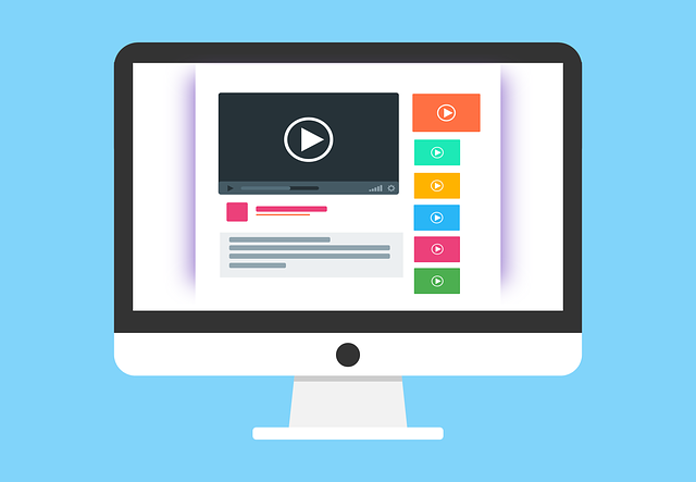
- Visual Content: As landing pages couldn’t be as descriptive as a website and yet has to succeed in compelling the customer to make the final purchase, visual content could be helpful. Visual content like images and videos are not only helpful in describing the product and company in a better way but also is appealing to the user’s eyes. User prefer to stay on a page that has a mix of visual and text content.
- No links: Avoid putting any kinds of links in your landing page. A landing page is designed to convert the customer and not giving them much options to explore. They already are aware about what they are looking for by going through the advertisement that made them land on your landing page. Involving links is like giving them an opportunity to explore more which would also lead to distractions. You could put up a handful of links in your website but when it comes to landing page links equals to distraction. And that is not something that as an owner you would want for your customers.

- Clear Separation: With one page sites it is always recommended to use some form of separation to separate your content in order to make it look for appealing and less crowded. If back to back content is placed with any proper formatting the user would feel crowded and confused. Then they might even abandon the page without making a purchase.
- Call to Action: A landing page without a clear call to action feature is completely meaningless. The core purpose of designing a landing page is to make the customer buy the product or service, if there is no action button which they can use to proceed to the last step then what is the point of having the landing page. By clear call to action what is meant is to use correct font style and design that would grab the attention of the customer immediately. If CTA is some kind of forms that the customer has to fill then make sure that it is not too lengthy. Ask only necessary information in order to make the process easy.
Let’s close this article by remembering two key success factors of a landing page. One is to always remember matching the landing page content with the content of your advertisement. Because it is a form of advertisement that you have put out on the online platform that leads your visitors to your landing page. Making use of similar content would make the user easily relate with the content. Second is to remember that there can be multiple landing pages. In fact top web design companies are of the opinion that it is better to design a separate landing page for separate types of advertisements.
1,470 total views, 2 views today


